Context:
Revamp of KMV Project's Website
Role:
UX/UI Designer
Duration:
Aug 2023 - Jan 2024
My individual contribution
I was hired as the first and only designer on the team to work closely with developers to revamp the KMV Projects website. This project involved heuristic analysis, user research, designing, prototyping, and occasionally building a no-code version of the website on Wix before the final version was coded by the development team.
Being the sole designer taught me many valuable lessons. Most importantly, I learned how to effectively collaborate with the Board of Directors, the CEO, and all the engineers to build the best product possible.
Client details
Understainding the company
About
KMV Projects is a major Indian construction firm specializing in large-scale infrastructure and urban development. Their work spans highways, bridges, industrial, and commercial buildings.
Design Challenge
KMV Projects needed a modern, user-friendly website that reflected their scale, credibility, and engineering expertise. The existing site was outdated, non-responsive, and lacked intuitive navigation, making it hard for users to explore their vast portfolio.
The primary goals were to:
-
Improve user experience and visual hierarchy
-
Ensure mobile responsiveness across all devices
-
Highlight key projects and services clearly
-
Align the design with KMV’s brand identity and professionalism
-
Support better lead generation through improved information architecture and CTAs
Project tags
01
/
CHAPTER
RESEARCH
Website Audit
Understanding the Existing Experience
Audit Scope & Objectives
Before redesigning, I conducted a comprehensive UX & UI audit of the existing website to identify usability gaps, content issues, and visual inconsistencies.
The audit covered:
-
Homepage
-
About & leadership pages
-
Projects pages
-
Careers page
-
Contact page
-
Mobile responsiveness
Key Audit Findings
Weak First Impression & Credibility
-
Outdated layout and inconsistent spacing
-
No strong above-the-fold messaging
-
Project strength not immediately visible
Navigation & Content Clarity Issues
-
Non-persistent header
-
Poor content hierarchy
-
Important pages difficult to access
Content Overload & Poor Scannability
-
Long, dense sections without visual grouping
-
Excessive vertical space pushing key content below the fold
Visual & Typography Inconsistencies
-
No defined grid system
-
Inconsistent font sizes and icon styles
-
Low contrast affecting readability
Mobile Experience Gaps
-
Layout breakage on smaller screens
-
Text and spacing not optimized for mobile users
.png)
Key Observations
The challenges that shaped the redesign
Strategic Objectives Post-Audit
Based on the audit findings, the next step was to align business expectations with real user needs across clients, investors, and job seekers.
The objective was to define how the website should support credibility, discovery, and action—while reflecting KMV Projects’ scale and operational maturity.
Key Experience Insights
Corporate Credibility
Users judged the company’s credibility within the first few seconds of landing on the website.
An outdated interface and inconsistent layout reduced trust, despite KMV having strong real-world projects.
Navigation & Clarity
Important information such as projects, services, and contact details was difficult to find.
Users expected a clear structure that reflects how infrastructure companies operate at scale.
Mobile Experience
A large portion of users accessed the website on mobile devices, but the existing experience was not optimized, leading to frustration and early drop-offs.
Research Approach & Constraints
For this project, direct access to end users was limited.
To understand business needs and operational realities, I conducted stakeholder interviews with Board of Directors, internal teams, and employees across departments.
These conversations helped uncover business priorities, content gaps, and internal challenges that the website needed to address—while still keeping end-user clarity in mind.
Key questions explored
What role should the website play in supporting KMV Projects’ business growth and brand perception?
Which information is most frequently requested by clients, partners, and job applicants?
What content must be clearly visible to avoid confusion or repeated inquiries?
How can the website structure reflect KMV’s scale, project diversity, and credibility?
How important is mobile accessibility for stakeholders when sharing company information externally?
Outcome of stakeholder insights
-
Clear prioritization of Projects, About, Careers, and Contact
-
Simplified content hierarchy aligned with business needs
-
Professional visual language to reinforce trust
-
Mobile-first layouts for quick information sharing
Competitive analysis
Competitive Landscape & Market Signals
Large National EPC Players


Positioning
Enterprise-scale, credibility-first, process-driven
What works well
-
Strong hero messaging with measurable achievements
-
Clear project categorization by sector and geography
-
Consistent visual hierarchy across pages
Gaps observed
-
Content feels corporate-heavy
-
Less focus on storytelling behind projects
-
Navigation depth can feel overwhelming
Mid-size Regional Infrastructure Brand


Positioning
Growth-focused, project-driven, operational clarity
What works well
-
Projects showcased as proof of capability
-
Balanced mix of visuals and content
-
Clear service offerings aligned with business goals
Gaps observed
-
Limited brand differentiation
-
Inconsistent mobile experience
-
Weak leadership and vision storytelling
Modern Engineering / Construction Brand


Positioning
Modern, people-centric, experience-led
What works well
-
Clean layouts with strong visual rhythm
-
Minimal content with high scannability
-
Mobile-first interactions
-
Clear calls-to-action for different audiences
Gaps observed
-
Lighter emphasis on large-scale credentials
-
Less detailed project depth
-
May feel less “heavyweight” for government clients
A clear gap existed across competitor websites: large EPC players leaned heavily on scale but lacked clarity, regional firms showed capability without differentiation, and modern brands prioritized aesthetics over enterprise trust. KMV’s opportunity was to combine credibility, clarity, and contemporary storytelling into a single, confident digital presence.
02
/
CHAPTER
Strategy
Strategy Pillars
Establishing a Trust-Led Digital Foundation
Experience Audit Focus
-
Trust-first communication through clear messaging and hierarchy
-
Audience-based content prioritization
-
Simplified and scalable information architecture
-
Mobile-first responsiveness
-
Consistent visual language aligned with industry standards

PERSONA DETAILS
Synthesizing stakeholder insights

Rajiv Mehta
Age: 45
Role: Project Head / Procurement Manager
Location: Tier 1 & Tier 2 cities across India
Industry: Infrastructure / Government / Private Development
" Rajiv oversees vendor selection for large-scale infrastructure and construction projects across multiple states. He evaluates companies based on credibility, scale, past projects, and compliance before initiating contact. "
Pain Points:
-
Difficulty understanding company capabilities from outdated websites
-
Lack of structured project information
-
Unclear leadership and credentials reduce trust
Goals & Website Needs:
-
Quickly evaluate KMV’s capabilities, credibility, and scale
-
Review completed and ongoing projects by category
-
Build confidence before shortlisting vendors
-
Access clear contact details for business inquiries
Anil Khanna
Age: 52
Role: Investor / Strategic Partner
Location: Pan - India
Interest: Long-term infrastructure growth
" Anil evaluates infrastructure companies for potential investment or partnerships. He looks for companies with proven execution, leadership stability, and growth vision. "
Pain Points:
-
Websites that focus only on visuals without data
-
Missing company story or leadership information
-
Lack of clarity around long-term direction
Goals & Website Needs:
-
Quickly evaluate KMV’s capabilities, credibility, and scale
-
Review completed and ongoing projects by category
-
Build confidence before shortlisting vendors
-
Access clear contact details for business inquiries

Ritika Awasthi
Age: 28
Role: Electrical Engineer
Location: Hyderabad
Experience: 6 to 10 years
" Ritika is an experienced electrical engineer looking to move into a reputed infrastructure company where she can work on large, meaningful projects while maintaining work-life balance. "
Pain Points:
-
Limited information about company culture on websites
-
Unclear career growth paths
-
Difficulty differentiating real project work from marketing claims
Goals & Website Needs:
-
Explore career opportunities in a reputed infrastructure firm
-
Understand project scale and technical exposure
-
Assess company stability and growth prospects
-
Find clear careers and hiring information

Information Architecture
A clarity-driven architecture built to support growth.
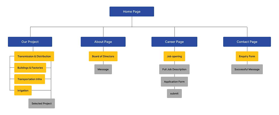
Content prioritization
Content was prioritized using an impact-vs-importance matrix to surface decision-critical information and reduce noise across pages.

03
/
CHAPTER
Execution
Navigation & Page Structure Decisions
Defining Navigation & Wayfinding Strategy
About
The website structure was redesigned to reduce navigation depth and surface credibility early in the journey. Primary pages—Projects, About, Careers, and Contact—were prioritized to reflect the most frequent stakeholder needs and business touchpoints.
Projects were organized by sector and expertise to make KMV’s scale and execution capabilities immediately clear, while supporting faster scanning for decision-makers. Supporting content was consolidated to eliminate duplication and guide users toward clear next actions.
This approach balanced enterprise-level credibility with simplicity, ensuring the structure remained intuitive, scalable, and effective across devices.
Key decisions
-
Reduced top-level items to focus on Projects, About, Careers, and Contact
-
Grouped services and sectors under Projects for faster scanning
-
Clear CTAs for business inquiries and job applications
-
Consistent navigation logic across desktop and mobile

Wireframes
Defining Page Structure & Content Flow
About
Low-fidelity wireframes were created to validate structure, hierarchy, and flow before visual design.
This allowed faster iteration and early stakeholder alignment without visual bias.
Wireframes validated
-
Content prioritization per page
-
Navigation clarity and user flow
-
Placement of trust signals and CTAs
-
Mobile-first responsiveness

-
Credibility surfaced immediately: It visually ties to “above-the-fold priority” without calling out a headline or CTA.
-
Clear vertical narrative: This shows content sequencing, not layout details.
-
Leadership visibility builds trust: It signals emphasis on who is shown first, not the profile card itself.
-
Values structured as scannable proof: This communicates information grouping, not component design.
-
Projects categorized for relevance: The insight is about discoverability, not filters.
-
Scale emphasized over aesthetics: This reinforces evaluation criteria without pointing at numbers.
03
/
CHAPTER
Interaction
Visual & System Design
Establishing a Cohesive Visual Language
Visual Hierarchy & Consistency
Visual hierarchy was established through consistent layout patterns, spacing, and typography across pages—helping users scan content quickly and understand KMV’s scale and credibility.
Key Screens
Homepage
The homepage was redesigned as a trust-first entry point, surfacing KMV’s projects, sectors, and credibility early in the experience.


Projects Page
Projects were repositioned as the primary proof of execution, organized to support fast evaluation by sector and expertise.
.png)


Other screens

Outcome & Key learning
Defining Page Structure & Content Flow
Outcome
The redesigned website shifted KMV from an information-heavy presence to a trust-led experience. Key pages were restructured to surface credibility early, improve navigation clarity, and support mobile-first access.
-
Established a clear, credibility-first digital presence
-
Simplified navigation to surface projects and proof early
-
Improved content scannability across key decision pages
-
Delivered a consistent, mobile-first experience
Reflection
This project reinforced the value of hierarchy and restraint in enterprise design. Given more time, I would validate decisions through stakeholder testing and evolve a scalable design system.
-
Clear structure builds more trust than heavy visuals
-
Reducing choices improved engagement and clarity
-
Strategic restraint mattered more than adding features