Role: UI / Product Designer
Scope: Design System, Dashboards, Invoice Flow
Tools: Figma
SoloLedger is a web-based accounting and invoicing product designed to help freelancers and small businesses manage their finances through a unified dashboard experience. The project focuses on creating a clear, scalable interface for handling invoices, transactions, and reports, while maintaining consistency across data-heavy screens through a system-driven UI approach.
__Project Overview & Goal
Bringing clarity to accounting for freelancers and small businesses
Problem Statement:
Freelancers and small businesses often rely on fragmented tools or overly complex accounting software to manage invoices, transactions, and financial reports. These platforms frequently present dense data without clear hierarchy, making everyday financial tasks time-consuming and prone to errors. There is a need for a structured, intuitive interface that simplifies financial workflows while maintaining clarity across data-heavy dashboards.
The Challenge
Accounting products often suffer from:
-
Visually overwhelming dashboards
-
Inconsistent components across screens
-
Complex invoice creation flows
-
Poor hierarchy in data-heavy interfaces
The challenge was to design an interface that feels:
-
Trustworthy
-
Easy to scan
-
Consistent across multiple dashboards
-
Simple to extend as the product grows
Design Goals
-
Create a clean, modern UI suitable for financial data
-
Build a reusable design system before designing screens
-
Reduce cognitive load in dashboards and tables
-
Design a guided invoice creation experience
-
Ensure consistency across all product areas
01
/
CHAPTER
STRUCTURE
__Information Architecture
Designing structured financial workflows for speed and clarity.
Information Architecture
A simple, task-based information structure supports fast navigation across invoices, transactions, and reports, while allowing all dashboards to share a common layout system.
-
Clear separation between overview and detailed views
-
Predictable navigation across all product areas

Layout Structure
Structuring financial workflows for fast access and predictable navigation
The layout was designed to make complex financial tasks feel structured and easy to navigate. Since accounting interfaces are data-dense by nature, the focus was on creating a predictable structure that helps users quickly locate key information and take action without friction.
1. Predictable Navigation Patterns
Similar layouts are maintained across all core workflows (invoices, expenses, reports) to create familiarity. Users don’t need to relearn the interface when switching sections — structure remains consistent while content changes.
2. Reduced Visual Clutter
Unnecessary visual elements were removed to keep attention on essential financial data. The structure prioritizes clarity over decoration, supporting faster task completion.
3. Modular Content Blocks
Information is grouped into modular sections, allowing scalability as features expand. This modular structure ensures the interface can grow without breaking consistency.
4. Clear Information Hierarchy
Each screen follows a consistent top-to-bottom hierarchy:
-
Primary summary (KPIs / key metrics) at the top
-
Action controls (filters, search, CTA) next
-
Detailed data (tables, breakdowns) below
5. Functional Zoning
Content is divided into clear zones:
-
Navigation zone (sidebar/header)
-
Summary zone (high-level insights)
-
Action zone (create invoice, add expense, filter data)
-
Data zone (transaction tables and financial logs)

02
/
CHAPTER
Design System
__Design System
Building a scalable visual language for consistency across dashboards
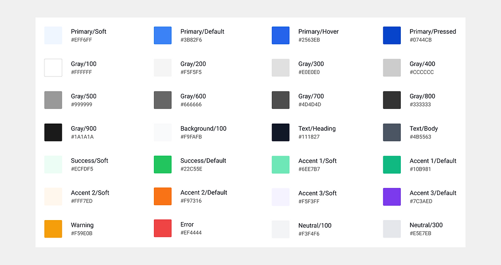
Color & Visual Language
The color palette balances neutral tones with a single primary accent to maintain clarity and trust.
-
Neutral colors support long sessions with financial data
-
Primary color highlights key actions and important values
-
Status colors communicate invoice and transaction states clearly
Typography
Typography was optimized for readability and numeric clarity.
-
Clear hierarchy between headings, labels, and values
-
Medium-weight text for financial numbers
-
Consistent line heights to improve table scanning
This ensures data remains readable even in dense layouts.

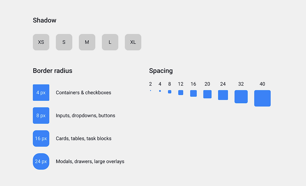
Spacing, Radius & Elevation System
A modular spacing scale is used across the entire product.
-
A modular spacing system maintains rhythm and alignment across all screens
-
Spacing is applied consistently at micro, component, and layout levels
-
Border radius differentiates UI hierarchy from small elements to large containers
-
Elevation and subtle shadows create depth without adding visual noise
-
Together, these rules ensure a structured, scalable, and calm interface
Component System
Core components include:
-
Buttons and actions
-
Inputs, dropdowns, toggles
-
Tables and rows
-
Cards and KPI blocks
-
Tabs and expandable sections
Each component was designed to be reusable and configurable, supporting multiple use cases across dashboards.
.png)

03
/
CHAPTER
Key Screens
__Main Dashboard
Presenting key financial insights at a glance through clear hierarchy
Purpose of the Dashboard
The main dashboard serves as a centralized financial overview, allowing freelancers and small businesses to instantly understand their current financial health. It provides quick access to income, expenses, outstanding invoices, and performance trends — reducing the need to navigate across multiple sections for basic insights.
Primary Financial Snapshot
-
Displays core metrics: Income, Expenses, Profit, and Outstanding
-
Provides an instant overview of financial performance
-
Uses semantic indicators and trend cues for quick interpretation
Insights & Operational Data
-
Visual trends help compare income and expenses over time
-
Tables surface recent transactions and activities
-
Structured grouping separates analysis from daily operations

Why This Structure Works
-
High-level metrics appear first for immediate clarity
-
Supporting insights follow in descending priority
-
Clear zoning reduces cognitive load and improves scanability
__Invoice Creation Flow
Designing a structured and flexible invoice experience for daily use
Purpose of the Dashboard
The Create Invoice screen guides users through a structured billing process, breaking down complex invoice creation into clear, manageable steps. By organizing information progressively and supporting draft saving, the interface allows users to complete invoices flexibly while minimizing errors and cognitive overload.
Progressive Section Design
-
Invoice form is divided into collapsible step-based sections
-
Users focus on one logical block at a time
-
Reduces cognitive overload in long financial forms
-
Keeps the interface clean even with multiple fields
Form Clarity & Grouping
-
Related fields are grouped for faster scanning
-
Labels are aligned for structured readability
-
Client details are prioritized before financial inputs
-
Clear CTAs guide progression (Save / Add New Client)

Why This Structure Works
-
Step-based structure prevents overwhelming the user
-
Predictable form grouping improves usability
-
Vertical flow supports long-form financial input naturally
-
Scales easily as more billing features are added
__Other Screens
Extending the same design principles across the product ecosystem
Beyond the main dashboard and invoice flow, the product extends the same structured design principles across all core workflows. The Invoice Dashboard focuses on filtering clarity and status visibility, the Transaction Dashboard emphasizes categorized financial tracking, and the Reports Dashboard presents analytical insights through organized data visualization.
Each screen maintains consistent hierarchy, spacing, and component behavior, ensuring a unified experience while adapting to different financial tasks.3
Invoice Dashboard
The Invoice Dashboard provides a centralized view of all issued invoices, allowing users to quickly monitor payment status, track pending amounts, and manage billing activity efficiently. It streamlines invoice oversight by combining filtering, status visibility, and quick actions in a single structured view.
-
Clear filtering and search controls for quick access
-
Semantic status badges for instant recognition
-
Structured table layout with aligned numeric values
-
Prominent “Create Invoice” action placement

Reports Dashboard
The Reports Dashboard transforms raw financial data into meaningful insights through structured summaries and visual analytics. It enables users to analyze performance trends, compare metrics, and make informed business decisions from a single unified view.
-
KPI summary positioned before analytical charts
-
Modular report sections for focused insights
-
Consistent data visualization patterns
-
Controlled use of color to reinforce semantic meaning

Transaction Dashboard
The Transaction Dashboard serves as a detailed financial log for tracking income and expenses. It helps users monitor cash flow, categorize transactions, and maintain transparency across financial records in a structured and organized interface.
-
Segmented filters for Income and Expense views
-
Category-based grouping for structured tracking
-
Status indicators for reconciliation clarity
-
Consistent table alignment for financial readability

04
/
CHAPTER
Learning
__Learnings
Key Learnings from designing complex financial interfaces
-
Designing data-heavy interfaces requires disciplined hierarchy and intentional spacing to prevent cognitive overload.
-
A system-first approach (tokens, components, and layout rules) significantly improves scalability and consistency across screens.
-
Financial dashboards demand clarity over decoration — subtle visuals often communicate more effectively than bold styling.
-
Breaking complex workflows into structured sections improves usability without needing multi-page flows.
-
Consistent component behavior across dashboards builds familiarity and reduces learning effort for users.