.png)
Role: UX / Product Designer
Scope: Research, Information Architecture, Mobile Experience Design, Design System
Tools: Figma, Miro, FigJam
NewNest is a multilingual mobile support ecosystem designed to help migrants navigate relocation with greater clarity and confidence. The product centralizes essential services such as housing, job discovery, documentation assistance, healthcare access, and community integration into one simplified experience.
The project focuses on reducing cognitive load, improving accessibility for low-literacy users, and embedding trust through structured service discovery and urgency-first design patterns.
__Project Overview & Goal
Navigating relocation without clarity, access, or support.
Project Statement
Migrants relocating to a new city often struggle with language barriers, unfamiliar systems, and limited access to verified services.
The lack of clear guidance and community support makes the first few months especially overwhelming.
Project Overview
This project explores the design of a multilingual support ecosystem that helps migrants move from survival to stability by providing:
-
Language and cultural guidance
-
Access to verified local services
-
Job and housing resources
-
Community connection
All within one simple, mobile-first platform.
Goals
-
Reduce Cultural & Language Friction: Design a multilingual, icon-driven interface that supports low literacy users.
-
Simplify Access to Essential Services: Provide clear, step-by-step guidance for housing, jobs, healthcare, legal aid, and transport.
-
Build Community & Trust: Enable local groups and safe, verified connections to reduce isolation.
-
Prioritize Accessibility: Ensure usability through voice support, simplified flows, and regional language options.
01
/
Chapter
Research
__Research Foundations
Exploring the emotional and practical challenges of building a new life.

Key Insights
-
Migration is largely driven by economic necessity and family relocation.
-
Inter-state movement reflects strong urban employment pull.
-
Relocation decisions are often urgent, not planned.
-
Early months are marked by instability and system unfamiliarity.
Behavioral Patterns
-
Language barriers limit access to digital services.
-
Trust in formal systems is low; informal networks dominate.
-
Documentation processes feel complex and intimidating.
-
Service discovery is fragmented across platforms.
-
Emotional isolation slows adaptation.
Opportunity Framing
-
Consolidate fragmented services into one trusted ecosystem.
-
Design for low literacy and multilingual access.
-
Embed visible trust and verification signals.
From research insights to a unified migrant persona.
__Primary Persona
A migrant rebuilding stability in a new city.
Derived from research patterns, the persona represents migrants managing urgent needs — housing, work, documentation, and healthcare — while adapting to unfamiliar systems and cultural norms.
It anchors design decisions around clarity, accessibility, and trust, ensuring the product supports both immediate survival needs and long-term integration goals.

__User Journey Map
Mapping the emotional and practical journey from arrival to integration.
The journey map highlights emotional and practical phases migrants experience:
-
Arrival — confusion, urgency, high dependency on guidance
-
Exploration — searching for housing, employment, documentation support
-
Adjustment — learning systems, language, and local norms
-
Integration — building stability, community, and confidence

Pain points cluster around service discovery, documentation clarity, and trust validation — reinforcing the need for centralized, guided access.
__Competitive Analysis
Evaluating existing solutions to uncover gaps in accessibility and trust.
Evaluating existing solutions
Analysis of current platforms revealed strengths in official documentation access and regional specialization. However, gaps remain in ecosystem integration, low-literacy accessibility, and trust communication.
Market Gaps
-
No unified platform connects housing, jobs, legal aid, and cultural integration in one ecosystem.
-
Most solutions overlook internal migrants and low-digital-literacy users.
-
Trust and verification signals are under-communicated in existing platforms.
-
Community-building features are often secondary or missing.

These findings validated the need for a more holistic and accessible support system.
02
/
Chapter
Structure
__Information Architecture
Organizing services around real priorities.
Research revealed that migrants don’t think in feature categories — they think in immediate needs: housing, work, documentation, and safety.
The IA was structured around real-life priorities rather than conventional app navigation patterns. Services were grouped to support a natural progression from survival to stability to integration.
IA Principles
-
Prioritize urgent needs first (housing, jobs, documentation).
-
Reduce cognitive load through clear, icon-led grouping.
-
Maintain shallow navigation to avoid multi-layer complexity.
-
Enable quick access to help and emergency resources.

__Sitemap
Mapping the support ecosystem.
Instead of separating information across disconnected sections, the ecosystem centralizes:
-
Housing & Shelter
-
Jobs & Work Opportunities
-
Documentation & Legal Help
-
Language & Cultural Guidance
-
Healthcare & Public Services
-
Community & Support Networks
Each category is designed to be independently accessible while remaining part of a connected ecosystem.

03
/
Chapter
Design Execution
__Wireframes
Exploring layout, hierarchy, and simplified navigation patterns.
The wireframes focused on validating layout structure, service grouping, and task clarity before moving into full visual design.
This stage emphasized hierarchy, navigation simplicity, and reduced cognitive load — ensuring essential services like housing, jobs, and documentation were immediately accessible.
Rather than designing for aesthetics, the focus was on usability:
Could users quickly understand where to go?
Could they complete key tasks with minimal friction?
Key Design Decisions
-
Urgency-First Layout: Critical needs such as housing, employment, and documentation were prioritized above the fold to reflect real-world relocation urgency.
-
Icon-Led Navigation: Service categories were supported with clear visual icons to reduce reliance on heavy text.
-
Shallow Navigation Depth: Core tasks were reachable within 2–3 taps to prevent confusion and drop-off.
-
Modular Card System: A consistent card-based layout improved scannability and predictability across screens.
-
Embedded Trust Signals: Verified labels, call buttons, and direct access to support services were integrated early to reinforce platform credibility.
Validation Outcome
The structured wireframes confirmed that the ecosystem could function with:
-
Minimal text
-
Clear service prioritization
-
Guided task completion
-
Reduced decision fatigue
This stage ensured structural clarity before advancing to visual refinement.

04
/
Chapter
Design System
__Design System
A calm and accessible visual language.
The visual language was designed to reinforce trust, clarity, and emotional safety while remaining highly functional for low-literacy and multilingual users.
Color, typography, and component structure were chosen to reduce cognitive load and improve readability across devices.
Color Strategy
The palette centers around calming greens and supportive yellows to communicate safety, guidance, and stability.
-
Green — Safety, reassurance, and verified support
-
Yellow — Guidance, attention, and key actions
-
Neutral tones — Reduce visual noise and support content clarity
Color contrast was carefully balanced to ensure accessibility and readability in diverse lighting conditions.

Typography
Typography choices focused on readability across screen sizes and language variations.
-
Clean, sans-serif typeface for high legibility
-
Clear hierarchy between headings and body text
-
Generous spacing to prevent text density
-
Designed to support multilingual expansion
The type system ensures that essential information remains easy to scan, even for users with limited digital familiarity.

The design system supports the product’s core principle: clarity over decoration.
05
/
Chapter
Final Screens
__Final Screens
Delivering a unified support ecosystem.
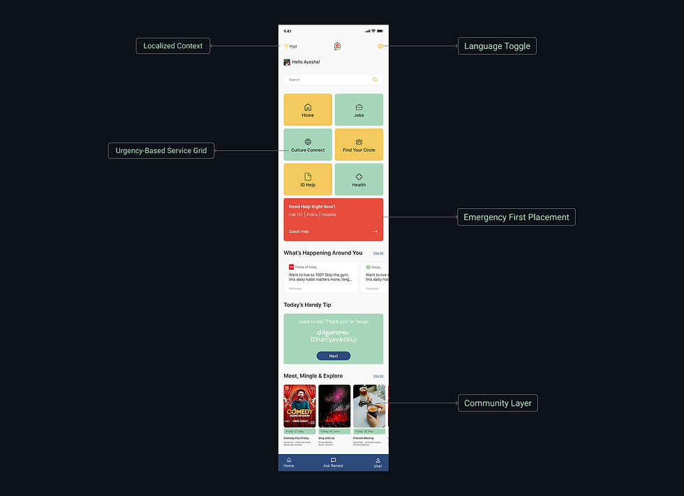
Home Screen
The dashboard is structured around urgency-based decision making, surfacing critical services while preserving access to long-term integration tools.
Visual grouping, consistent iconography, and controlled color hierarchy reduce cognitive effort and support confident task completion during early relocation stages.
.png)
Housing Main Screen
The housing experience reduces uncertainty during a high-stakes relocation decision.
Listings surface only essential details — rent, location, furnishing — enabling quick comparison and confident choices.
Embedded legal support strengthens trust and reduces reliance on informal networks.

Job Finding Main Screen
The job flow balances urgency with stability.
Skill-based access simplifies entry to immediate work, while rights and documentation guidance promote safer employment.
Structured job cards and clear actions support fast scanning and confident application decisions.
.png)
Other Screens
Beyond core flows, the ecosystem extends into language support, government access, transportation guidance, community engagement, and user profile management.
Each screen follows the same principles — clarity, accessibility, and trust — ensuring a cohesive experience across the relocation journey.
.png)
06
/
Chapter
Learnings
__Learnings & Reflections
Designing responsibly for real-world vulnerability and complexity
Designing for migrants reinforced the importance of clarity over complexity. When users operate under urgency and uncertainty, simplicity becomes a necessity, not a preference.
This project deepened my understanding of:
-
Structuring ecosystems around real-life priorities rather than feature lists
-
Reducing cognitive load through hierarchy and visual restraint
-
Embedding trust signals as core design components
-
Designing beyond literacy through icon-led and multilingual access
It also highlighted the importance of validating assumptions with real users, especially when designing for vulnerable communities.